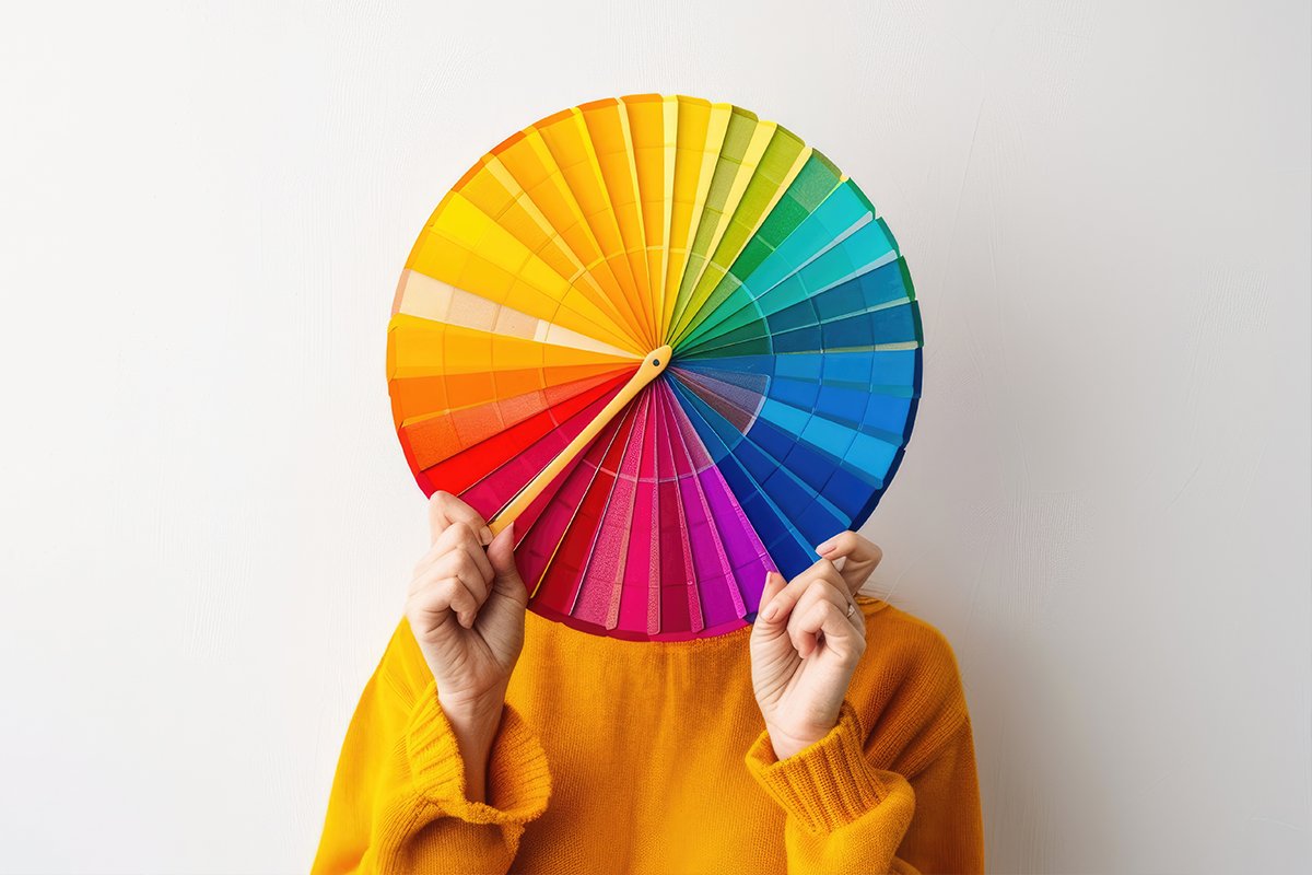
When it comes to building a brand, colors speak louder than words. The right color choices can evoke emotions, influence perceptions, and even drive customer behavior. This is where color psychology comes in—a strategic approach to selecting colors that align with your brand identity and messaging.
What is Color Psychology in Branding?
Color psychology is the study of how colors affect human emotions and decision-making. In branding, it helps businesses communicate personality, values, and emotions visually. From your logo and website to social media graphics, every color you choose plays a crucial role in shaping how your audience perceives your brand.
How Different Colors Impact Brand Perception
1. Red – Energy and Passion
Red is bold and attention-grabbing. It evokes excitement, urgency, and energy, making it ideal for brands in entertainment, food, and sports.
2. Blue – Trust and Professionalism
Blue conveys trust, calmness, and reliability. It’s widely used by tech companies, financial institutions, and healthcare brands to instill confidence.
3. Green – Growth and Balance
Green represents nature, health, and sustainability. Brands in wellness, eco-friendly products, and finance often use green to signal growth and harmony.
4. Yellow – Optimism and Creativity
Yellow sparks positivity, warmth, and creativity. It’s perfect for brands that want to appear cheerful and approachable.
5. Black – Luxury and Sophistication
Black communicates elegance, authority, and sophistication. Luxury brands and fashion industries often use black to create a premium feel.
6. Orange, Purple, and Other Colors
- Orange: Friendly, energetic, playful
- Purple: Creativity, imagination, royalty
- Pink: Compassion, femininity, calmness
The key is choosing colors that resonate with your brand values and target audience while creating visual harmony.
“Colors, like words, have meaning. They trigger feelings and associations that influence our decisions.”
Leatrice Eiseman
Pantone Color Institute
Why Color Psychology Matters in Branding
- Enhances Brand Recognition – Consistent color use increases brand recall by up to 80%.
- Influences Customer Decisions – Colors can subtly guide buying behavior and engagement.
- Communicates Brand Personality – Your color palette reflects whether your brand is playful, professional, luxurious, or eco-conscious.
- Differentiates from Competitors – A unique color scheme helps your brand stand out in a crowded market.
Tips for Choosing Your Brand Colors
- Start with your brand personality and values.
- Limit your palette to 2–4 main colors for consistency.
- Test colors in different contexts: website, social media, print.
- Consider cultural meanings of colors if your audience is global.
- Use tools like Adobe Color or Coolors to create harmonious palettes.
Final Thoughts
Color is more than just aesthetics—it’s a powerful communication tool. By understanding color psychology, you can craft a brand identity that resonates emotionally with your audience, builds trust, and strengthens recognition.
If you want your brand to leave a lasting impression through thoughtful color choices, I can help design a visual identity that captures your brand’s personality and connects with your audience.