Logo Folio is a curated collection of modern, minimalist logo designs crafted for diverse brands and industries. This series demonstrates how simplicity, clarity, and intentional design can create powerful visual identities
Objective
To explore and showcase minimalistic visual identity—stripping away unnecessary elements to focus on logo shape, proportional color usage, and brand personality distilled into clean forms.
Details
Time Frame:
Role:
Logo Designer
Involvement:
Logo Design, Typography


Scope & Approach
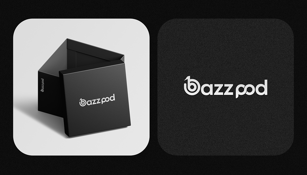
I developed a wide range of logo concepts, from typographic logotypes to abstract symbols, with a consistent emphasis on minimalism. Each design was crafted with clean lines, logical use of negative space, thoughtful typography, and a restrained color palette to ensure timeless appeal. To bring these concepts to life, I created both initial sketches and polished digital mockups, showcasing how the logos adapt seamlessly across real-world applications such as print materials and digital platforms.
Challenges & Learning
One of the key challenges was ensuring that each logo maintained its own distinct identity while still adhering to minimal design principles. Striking the right balance between legibility and uniqueness, particularly for abstract icons and mark-only designs, required careful consideration. Additionally, with such a large collection of logos, it was important to maintain visual consistency so the folio felt cohesive as a whole while still offering diversity in style and execution.


Solution
I created Logo Folio, a curated series of unique logo designs crafted with a focus on minimalism, clarity, and adaptability. Each logo was designed with clean lines, intentional typography, and balanced negative space, ensuring it communicates effectively in any size or medium. The collection includes a mix of typographic logotypes, abstract symbols, and modern marks, showcasing flexibility across industries — from corporate and lifestyle to startups and creative brands.
Results
The folio demonstrates how a strong logo doesn’t need to be complex to stand out. Each design tells its own story while maintaining functionality and timeless appeal. The collection has been well-received by design enthusiasts and potential clients, highlighting my ability to translate brand values into simple yet impactful visual identities. This project reinforces my design philosophy: less, but better.