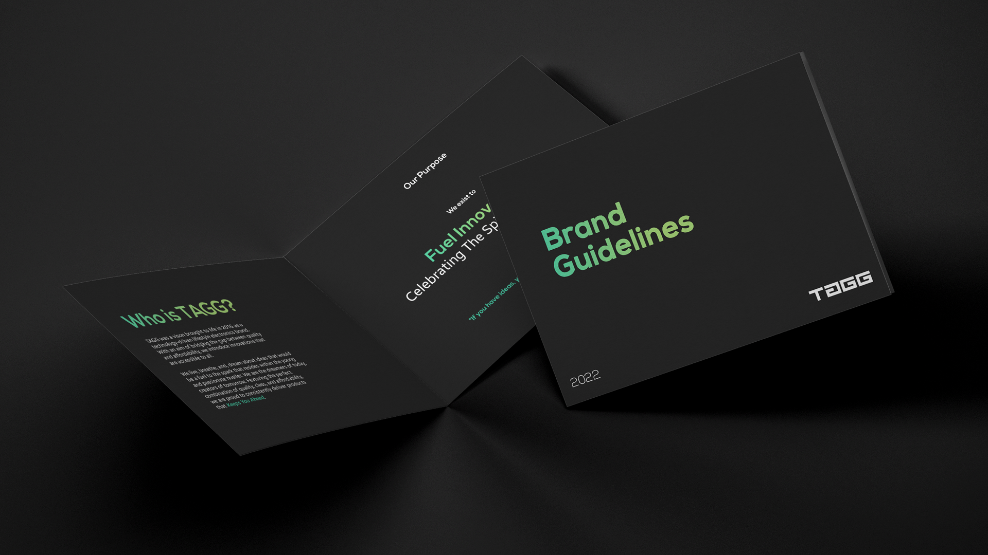
The Brand Guidelines project is a comprehensive visual identity. It establishes the visual and stylistic framework of a brand, defining its logo, color palette, typography, mockups, and other brand identity elements. This project demonstrates how consistent visual language and rules ensure a brand’s communication stays coherent and elevated across all mediums.
Design Features & Approach
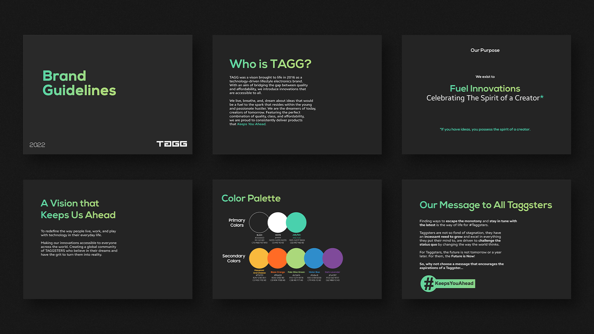
In this project, I crafted the brand’s foundational design elements with a focus on clarity and consistency. The logo design is paired with a well-defined color palette, ensuring colors work in harmony across digital and print contexts. Typography was chosen for legibility, personality, and flexibility, allowing for different weights and uses while maintaining identity.
I developed mockups and brand design layouts to visualize how the brand should appear in real-life applications—stationery, brand collateral, digital presence—making sure every element follows the guidelines. The approach is to give both freedom and constraints: enough creative space to adapt, yet strict rules to keep identity unified.
Details
Time Frame:
Jan 22 – Feb 22
Role:
Brand Developer
Software:
Illustrator, Photoshop
Challenges & Learning
One of the main challenges was balancing flexibility with discipline. Brand guidelines need to be strict enough that identity doesn’t get diluted, but also adaptable enough to serve multiple use-cases (print, digital, merchandise, etc.). Choosing color combinations and typography that look good both on screen and in print, under different lighting conditions, was another challenge.
Challenge
I also learned how important clear documentation is—mockups, margin rules, color codes, logo spacing—all have to be presented in a manner that anyone (designer, developer, printer) can follow. Ensuring that each guideline page is visual, practical, and not overwhelming was key.
Case-Story (Problem → Solution → Result)
Problem
Many brands struggle to maintain consistency across various touchpoints—logos get stretched, colors shift, typography styles vary. Without a clear manual, identity gets fragmented, which weakens brand recognition and trust.
Solution
I developed a robust Brand Guidelines document defining logo usage (size, spacing, variations), a fixed color palette with color codes, typography styles for headlines, body text, etc., and mockups/imagery to show real-world applications. Each section includes visual rules and examples to avoid misuse or confusion.
Result
The brand identity became unified across all media. Designers and partners had a single source of truth for how the brand should look, which minimized errors, improved production efficiency, and elevated the overall perception of the brand. It ensures that whether someone sees the brand online, in print, or on merchandise, they will instantly recognize it.