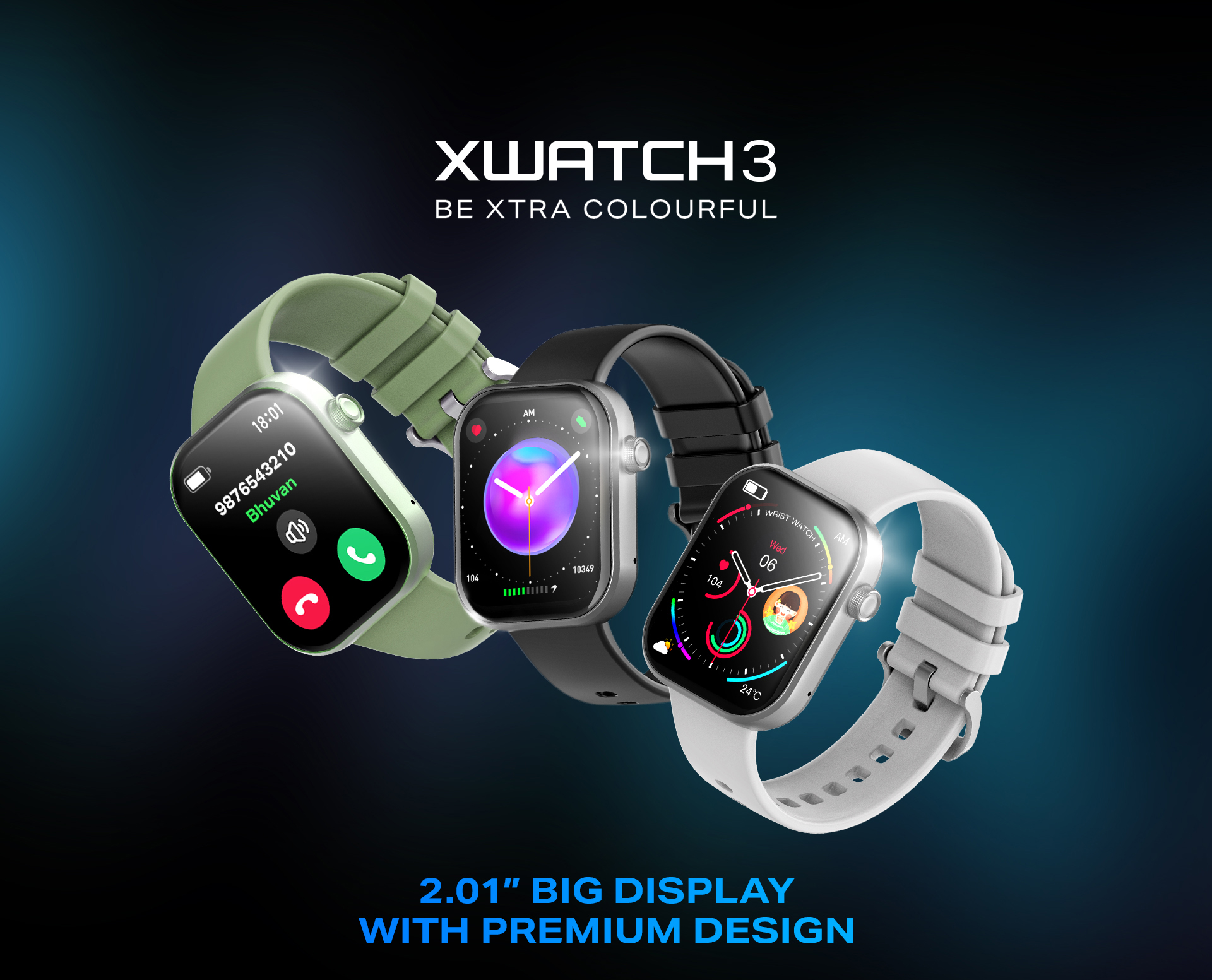
XWatch Smartwatch is a design project focused on creating a landing or product page that showcases a smartwatch in a sleek, clean, and engaging way. The page is designed to highlight the product’s features, visuals, and branding so users immediately understand the design, functionality, and aesthetic appeal of XWatch.
Design Features & Approach
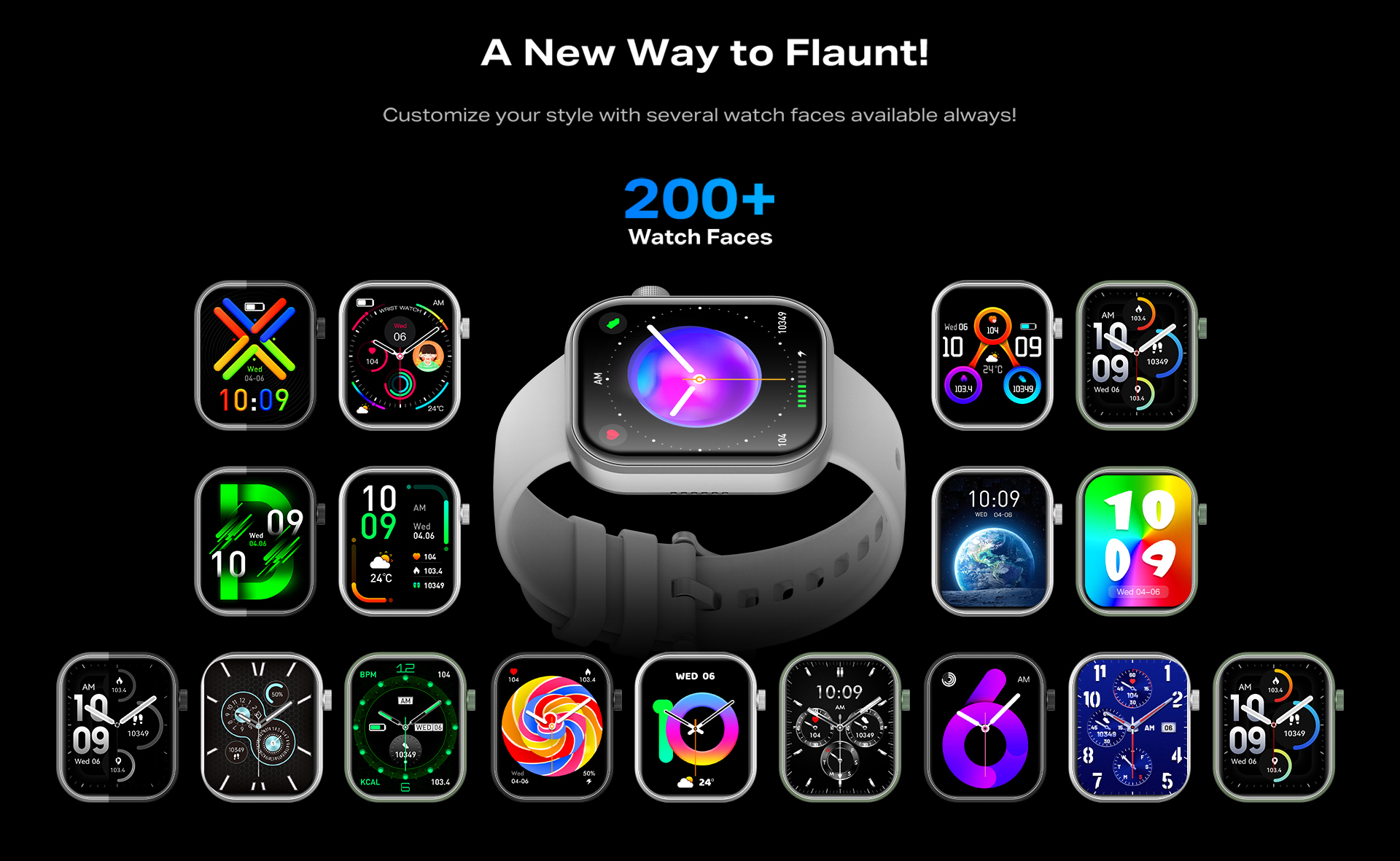
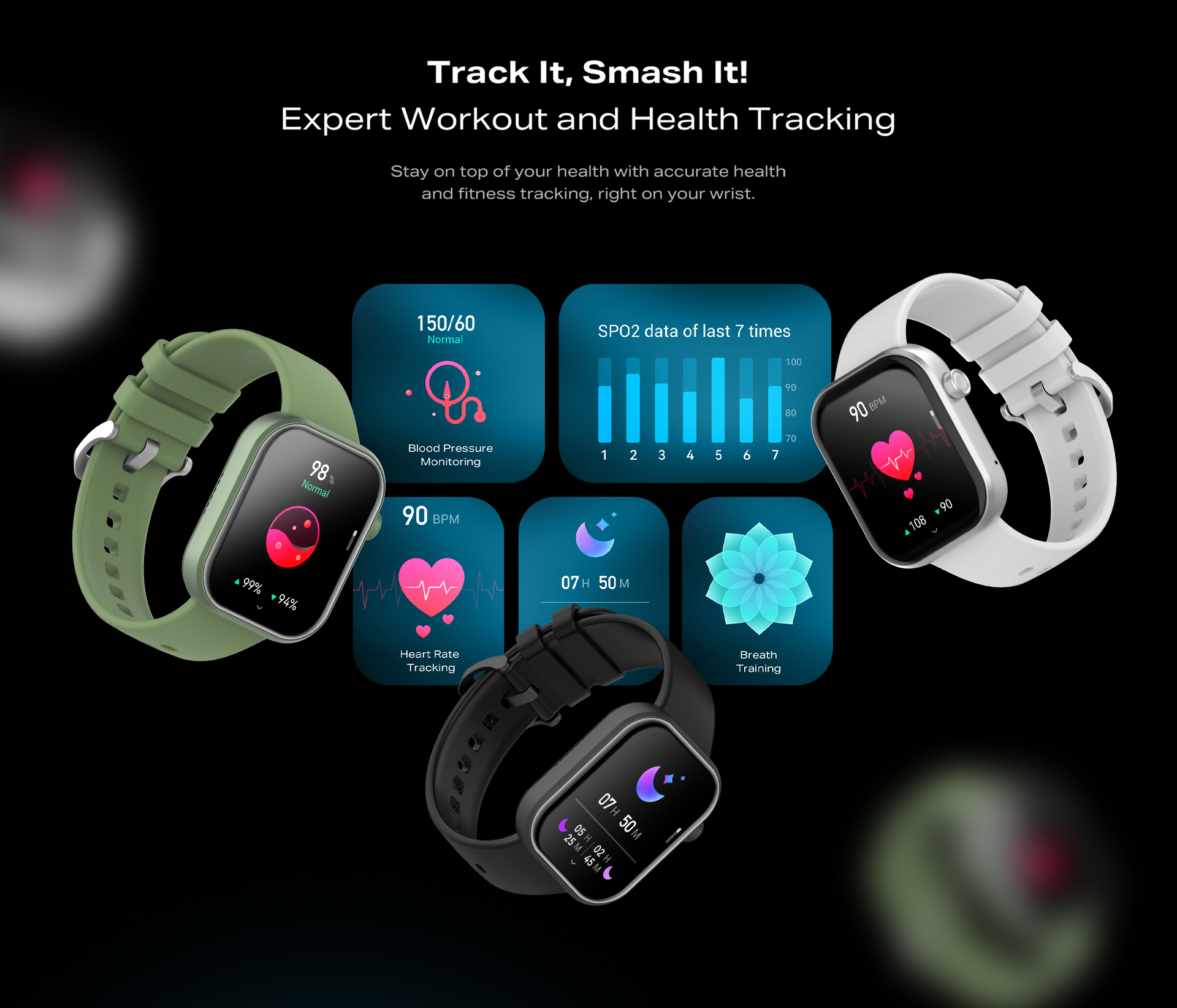
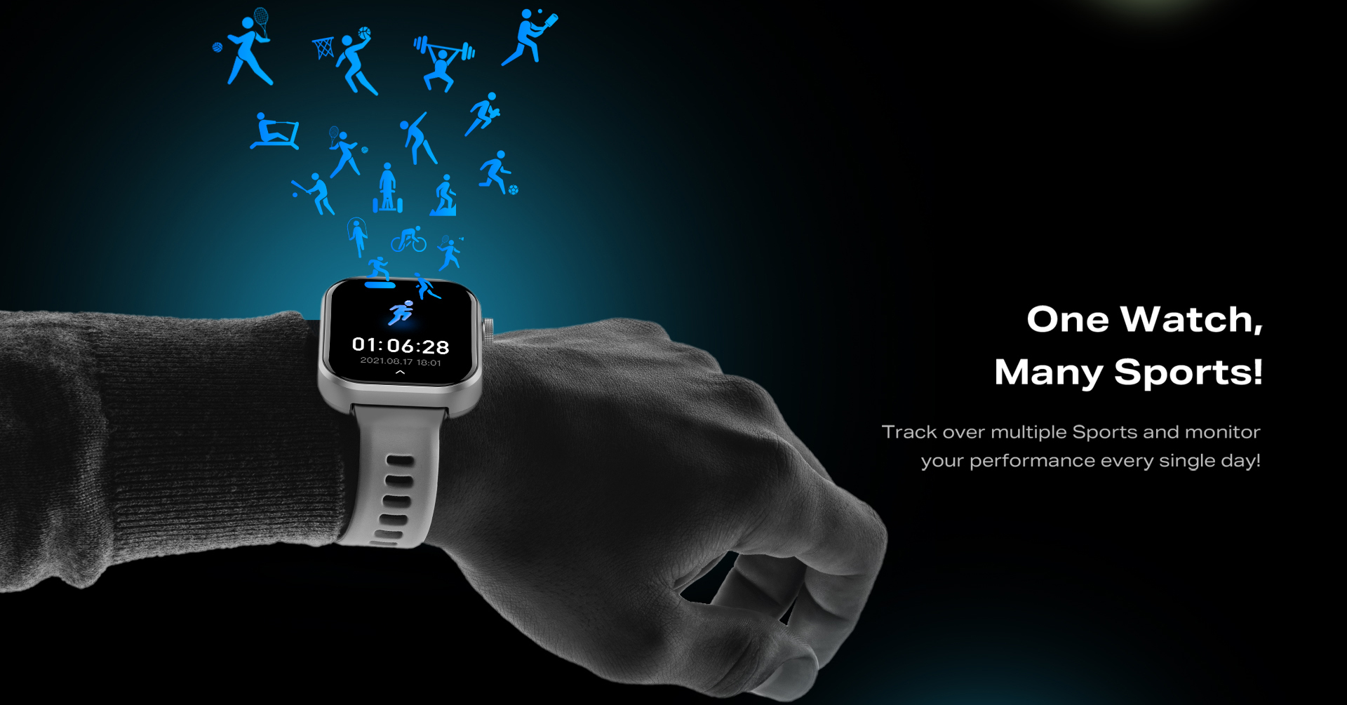
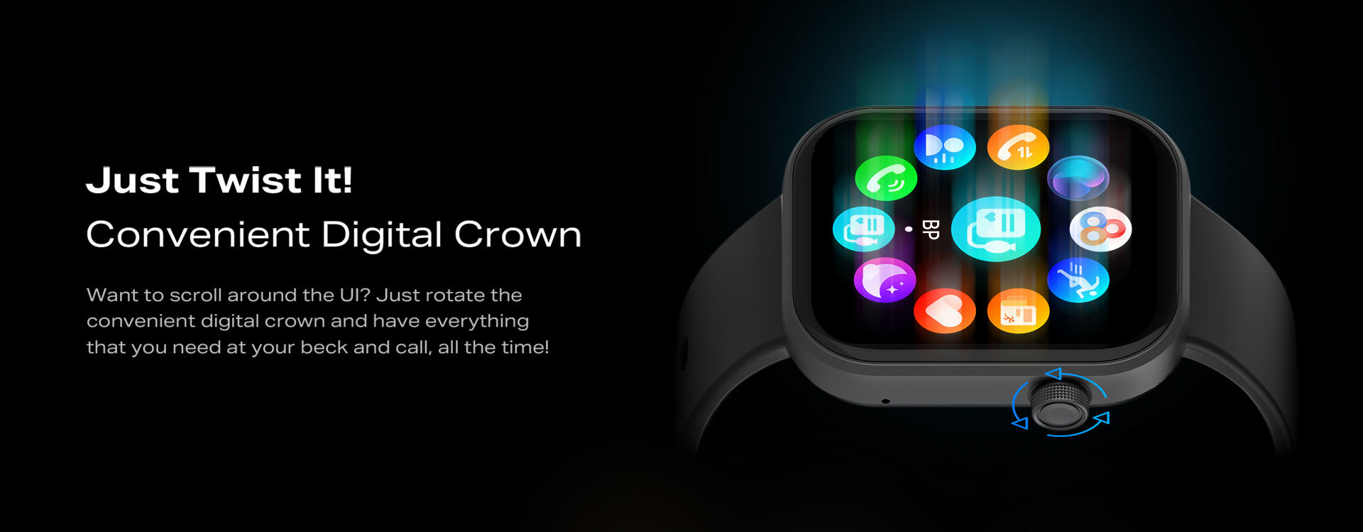
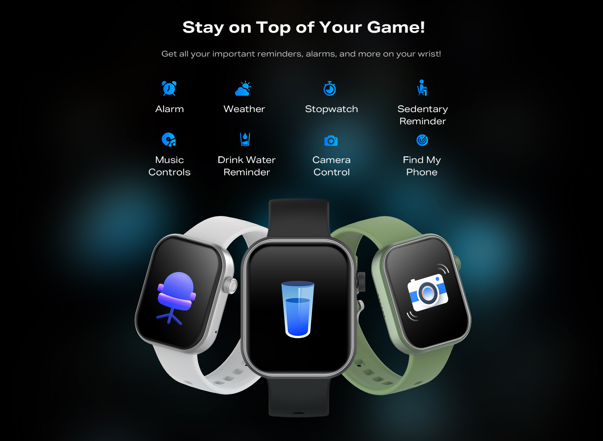
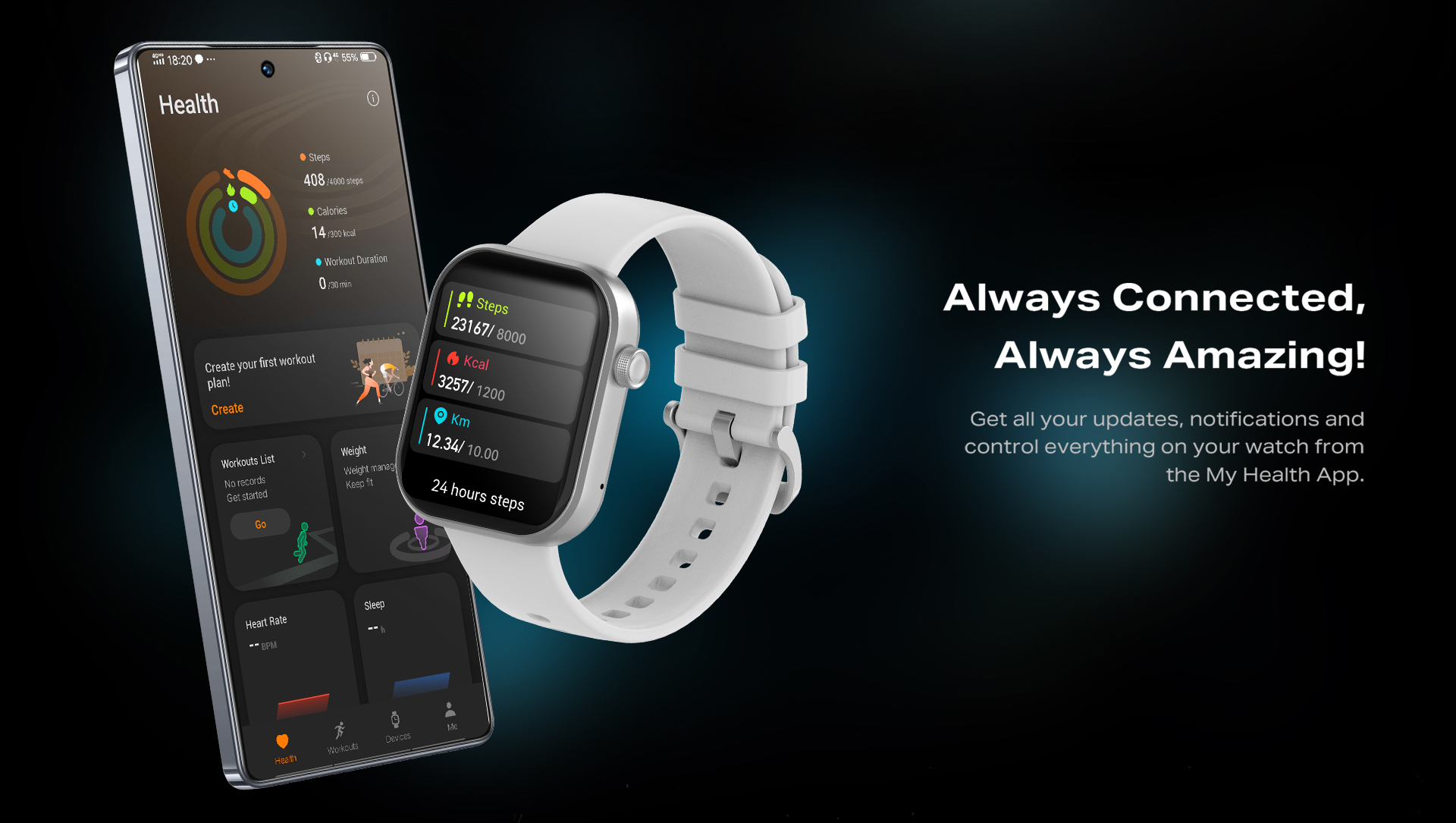
The design of the XWatch page emphasizes bold imagery, clear typography, and intuitive layout. A large hero section draws immediate attention to the smartwatch’s look and feel, followed by feature blocks that succinctly communicate key functionalities. The use of whitespace and consistent visual hierarchy helps ensure that product specs, features, and images all have room to breathe, making the page feel polished rather than cluttered. Iconography and visual elements maintain uniform style to reflect a premium tech brand identity, and interactive cues or visual accents guide users through the page flow. The approach prioritizes visual storytelling as much as usability, so the aesthetics support user engagement and clarity.
Details
Time Frame:
Jan 25 – Feb 25
Role:
Creative Designer
Software:
Adobe Photoshop
Challenges
One challenge was making sure that product visuals (watches, UI mockups, etc.) are impactful without slowing down perceived load speed or obscuring usability. Because smartwatch product pages tend to include many visuals, maintaining performance and responsiveness across devices (desktop, tablet, mobile) was important. Another challenge was balancing technical details (specs, feature lists) with visual storytelling—too much text or data would overwhelm; too little would reduce clarity.
Learning
I also learned the importance of aligning visual style (colors, icons, font sizes) with the branding so that even smaller elements feel purposeful and part of a cohesive identity.

Case-Story (Problem → Solution → Result)
Problem
Smartwatch product pages often struggle to strike a balance — they either overwhelm users with specs and visuals, or present generic layouts that fail to capture the product’s character and appeal. This can leave potential buyers unsure about what makes the product special.
Solution
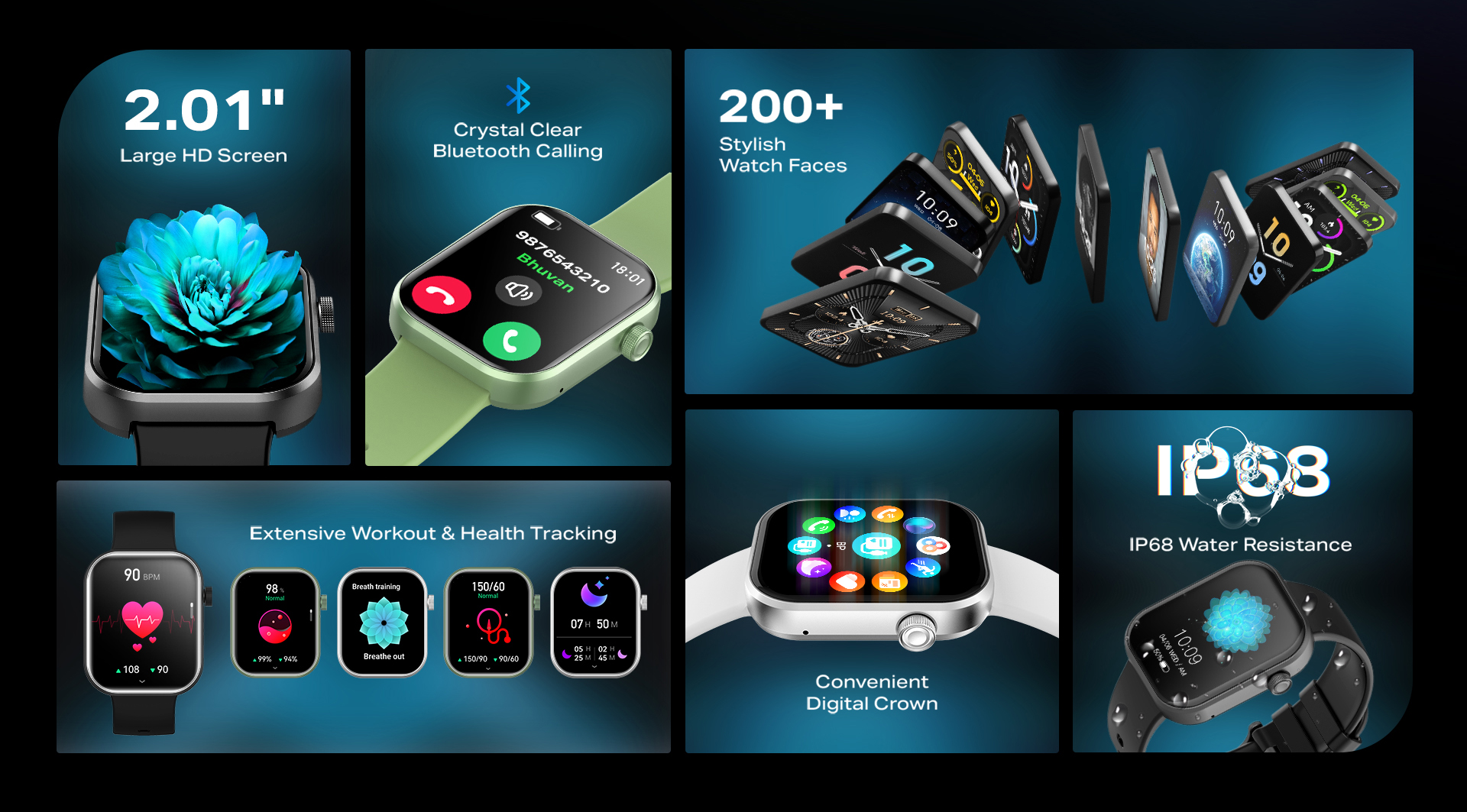
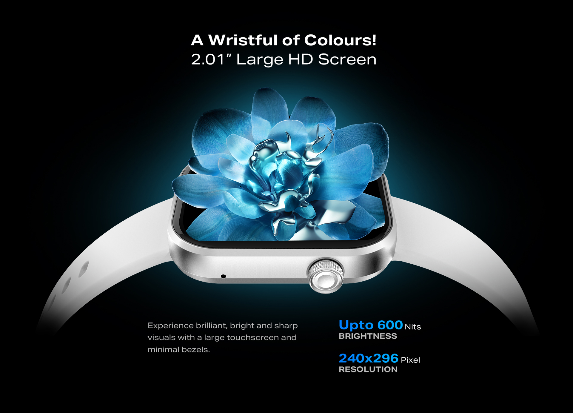
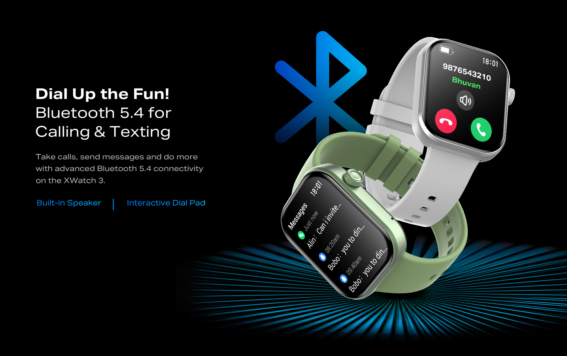
For the XWatch page, the design approach was to lead with visuals that convey style and quality, followed by well-structured sections that communicate features clearly. Visual hierarchy, clean typography, and carefully curated imagery were used to emphasize what matters: design, features, and user value. Feature blocks and icons helped break down technical details into digestible pieces, while whitespace and layout pacing were used to avoid information overload.
Result
The final design presents XWatch in a confident, visually appealing way. Users viewing the page can quickly grasp what the watch looks like, what it offers, and why it matters. The page feels premium, engaging, and trustworthy. It improves clarity and elevates brand perception, helping potential customers feel more informed and confident in the product.