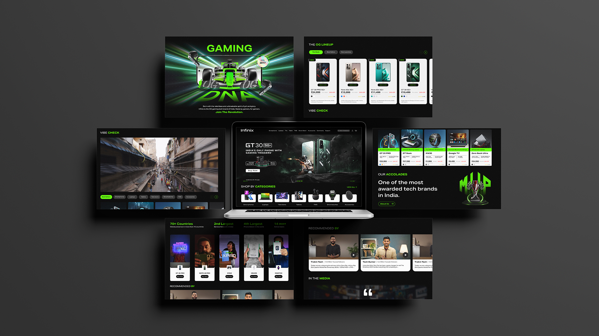
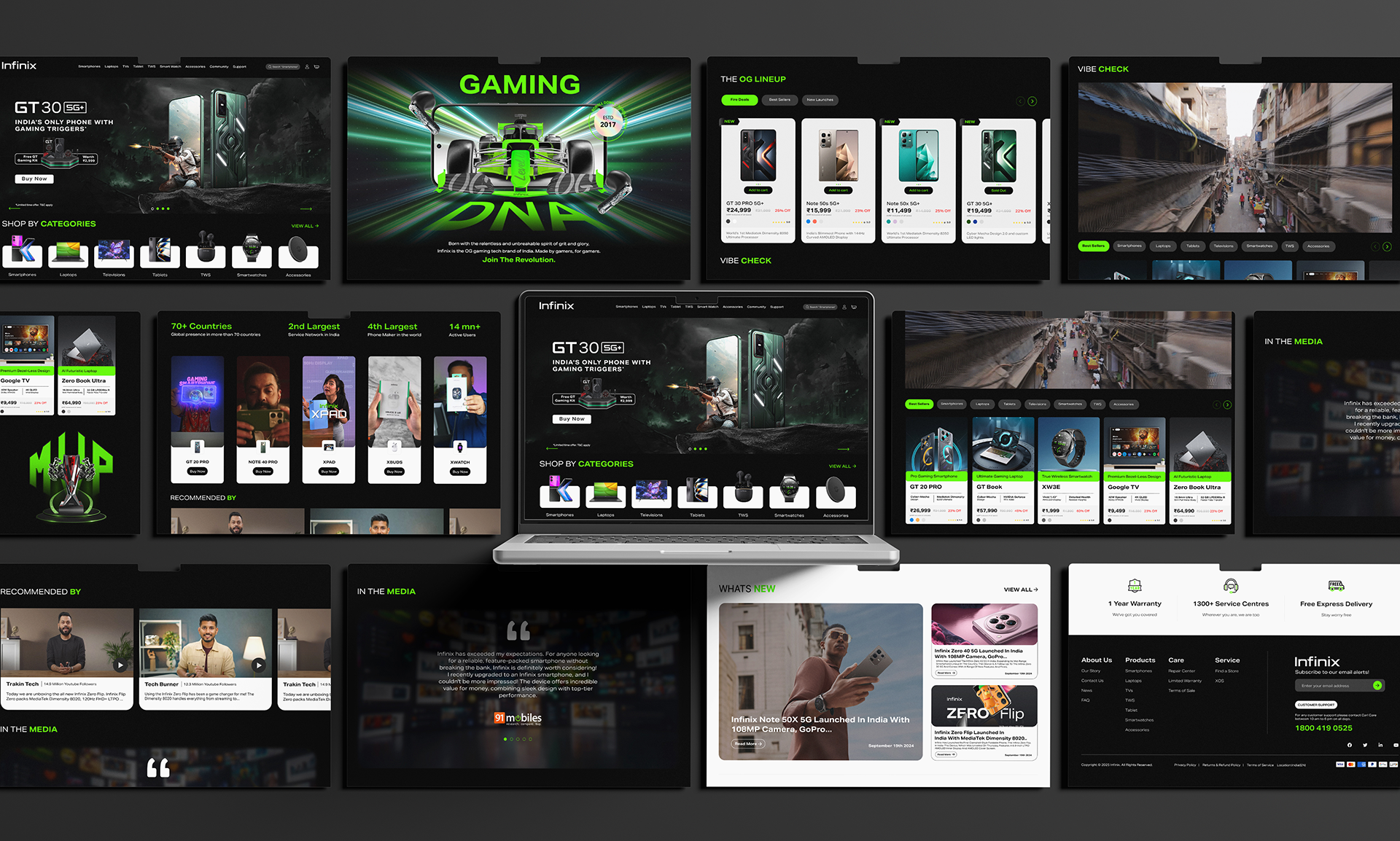
The Infinix Website UI/UX Design project is a full website revamp published on 2025. The project focuses on creating a modern, intuitive, and visually engaging user interface for the Infinix brand site. It aims to enhance user experience through clean layouts, clear navigation, and high-quality visuals, helping visitors quickly understand product offerings, features, and brand identity while making it easy to interact and explore.
Design Features & Approach
In this redesign, emphasis was placed on clarity and visual hierarchy. The layout uses generous whitespace, crisp typography, and consistent iconography to ensure content is easy to scan and pleasant to browse. Large hero banners showcase flagship products, followed by well-structured product feature sections and benefit-led messaging to engage users.
Navigation bars and menus are intuitive, with clear labeling and smooth transitions. Visual styling aligns with Infinix’s brand identity — color palette, imagery, and stylistic cues are harmonized. Responsive design is critical: layouts adapt smoothly across devices, ensuring that mobile, tablet, and desktop users get an optimized experience without compromising functionality or aesthetics.
Details
Time Frame:
Sep 25 – Oct 25
Role:
Involvement:
Adobe Photoshop, Figma
Challenges
One of the main challenges was balancing detailed product information with a clean, uncluttered layout. Presenting technical specs, features, and product comparisons without overwhelming the user required careful structuring and visual prioritization. Another challenge was ensuring consistency in visuals (images, icons, colors) across many sections while maintaining fast performance and quick page loads.
Learning
The process also taught the importance of testing responsive behaviors—how menus collapse, images scale, and interactive elements behave on smaller screens. Finally, aligning the design updates with existing brand assets (logos, tone, image style) while pushing for a fresher look required negotiation of what to preserve vs what to refresh.
Case-Story (Problem → Solution → Result)
Problem
The original Infinix website suffered from inconsistent visual presentation, confusing navigation, and overuse of dense information in places. Users often had to scroll too much or hunt for desired product information, which increased friction and lowered engagement.
Solution
The redesign introduced a cleaner layout with clear visual hierarchy: hero banners to grab attention, segmented product feature sections, readable typography, and intuitive navigation. Unnecessary clutter was removed, spec tables and details were organized into digestible sections, and important calls-to-action were made more visible. A responsive design ensured the site works seamlessly across devices, maintaining usability and aesthetics.
Result
The new UI/UX design significantly improves clarity and first impressions. Users can now find product info more quickly, enjoy more visually cohesive pages, and interact with the site with less cognitive load. The brand image feels stronger, more modern, and more trustworthy. Ultimately, this helps improve engagement, reduces bounce rates, and encourages deeper exploration of Infinix’s offerings.