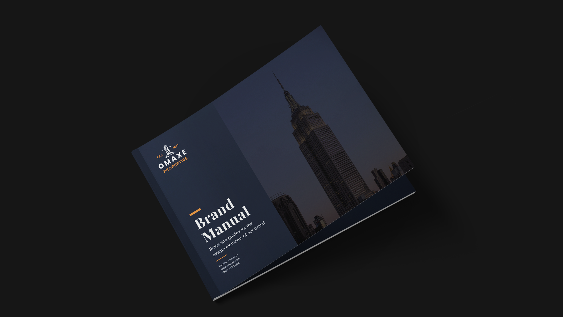
The Brand Guideline Design is a comprehensive manual that defines visual identity elements to maintain coherence and professionalism in brand communication. The project lays out rules for how the logo, color palette, typography, icons, and other brand collateral should look and be used across digital and print platforms. It aims to give both flexibility and structure so that designers, marketers, or partners have a clear reference for consistent brand expression.
Design Features & Approach
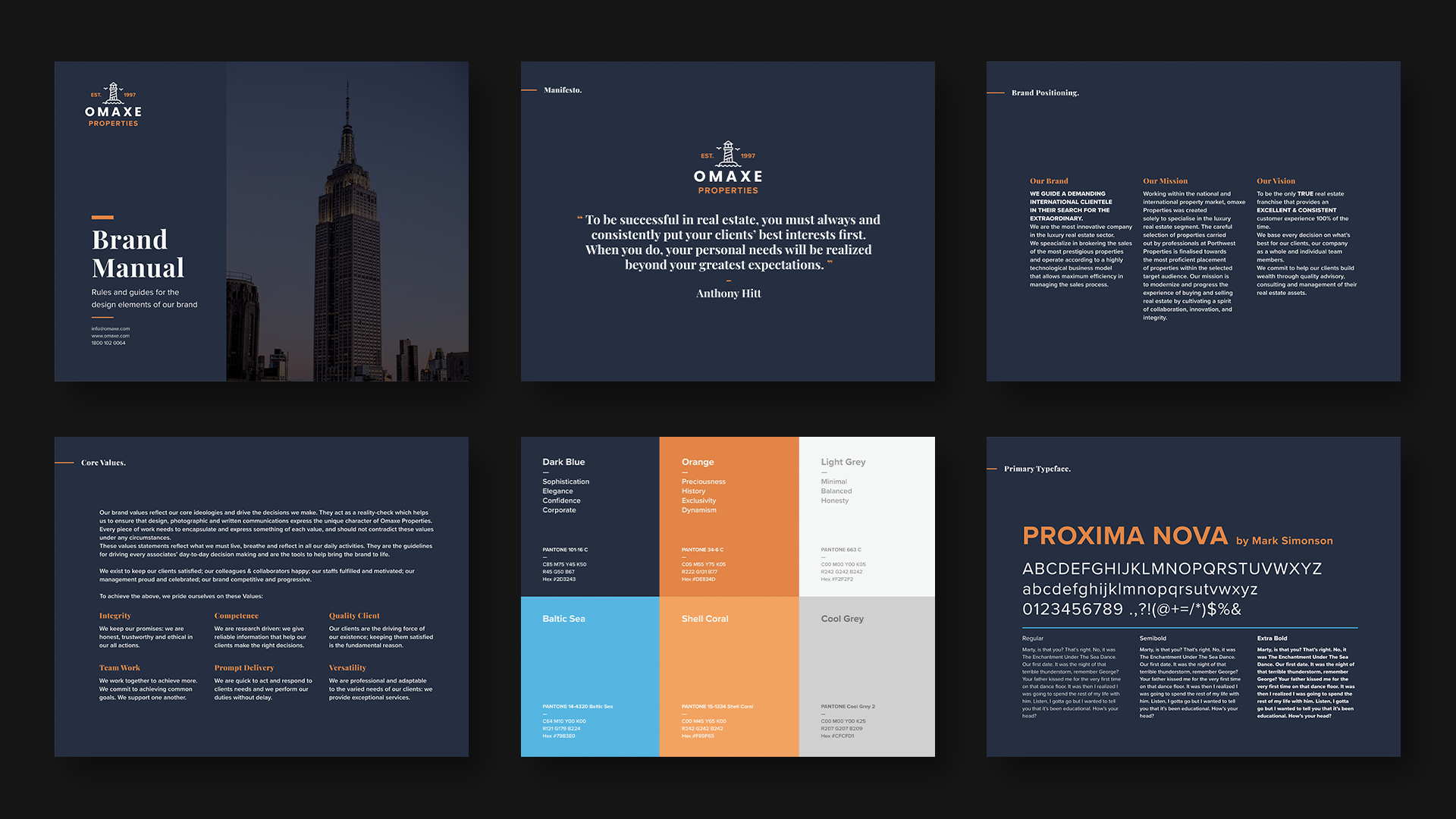
In this Brand Guideline Design, the approach was to build a system of visual rules that each brand asset can follow. I defined logo variations (primary, secondary, and usage scenarios), established a precise color palette with codes for digital and print use, selected typographic styles for headings, body text, and special uses, and designed iconography and mockups to demonstrate real-world applications.
The design emphasizes clarity and consistency: spacing, alignment, color contrasts, and logo spacing are all laid down to avoid misuse. Mockups include stationery, packaging, business cards, and signage to show how the brand appears in various touchpoints, ensuring that branding is not only conceptual but immediately applicable.
Details
Time Frame:
Jan 22 – Feb 22
Role:
Brand Developer
Software:
Illustrator, Photoshop
Challenges & Learning
One of the main challenges was balancing strict rules with enough flexibility: the guidelines needed to be clear to prevent brand drift, but also adaptable enough for different mediums (social media, print, signage, etc.). Deciding on typography and color values that reproduce well both on-screen and in physical print required many tests to ensure legibility and color fidelity.
Challenge
Another learning was about documentation: showing examples of misuse (what not to do) is as important as showing correct usage, to prevent inconsistent branding. Ensuring mockups felt real (holding physical constraints like margins, bleed, print behavior) added realism and usefulness to the guideline.
Case-Story (Problem → Solution → Result)
Problem
Without a strong brand guideline, visual identity becomes inconsistent—logos are misused, colors are off, typography is applied haphazardly, and the overall brand presence looks fragmented across different media.
Solution
I developed a full brand guideline document that defines logo variations and spacing rules, a robust color palette (with precise values for web and print), typographic hierarchy, iconography, and mockups. The guideline includes do’s & don’ts, real examples of branding in print and digital collateral, so everyone using the brand has clarity on how to maintain its visual identity.
Result
The brand’s visual identity became unified and consistent across all applications. Stakeholders and collaborators had a single source of truth to refer to, which reduced design errors and improved brand recognition. The guideline ensured that whether it’s a business card, a social post, or corporate stationery, the visuals feel part of the same family.