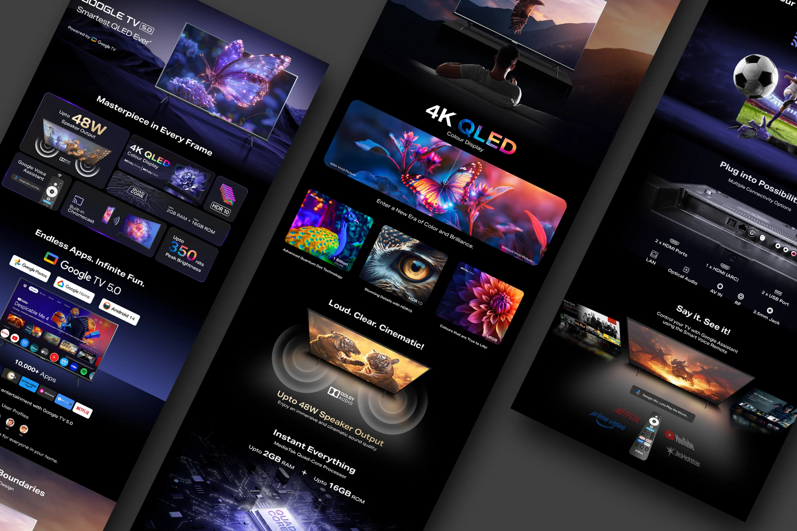
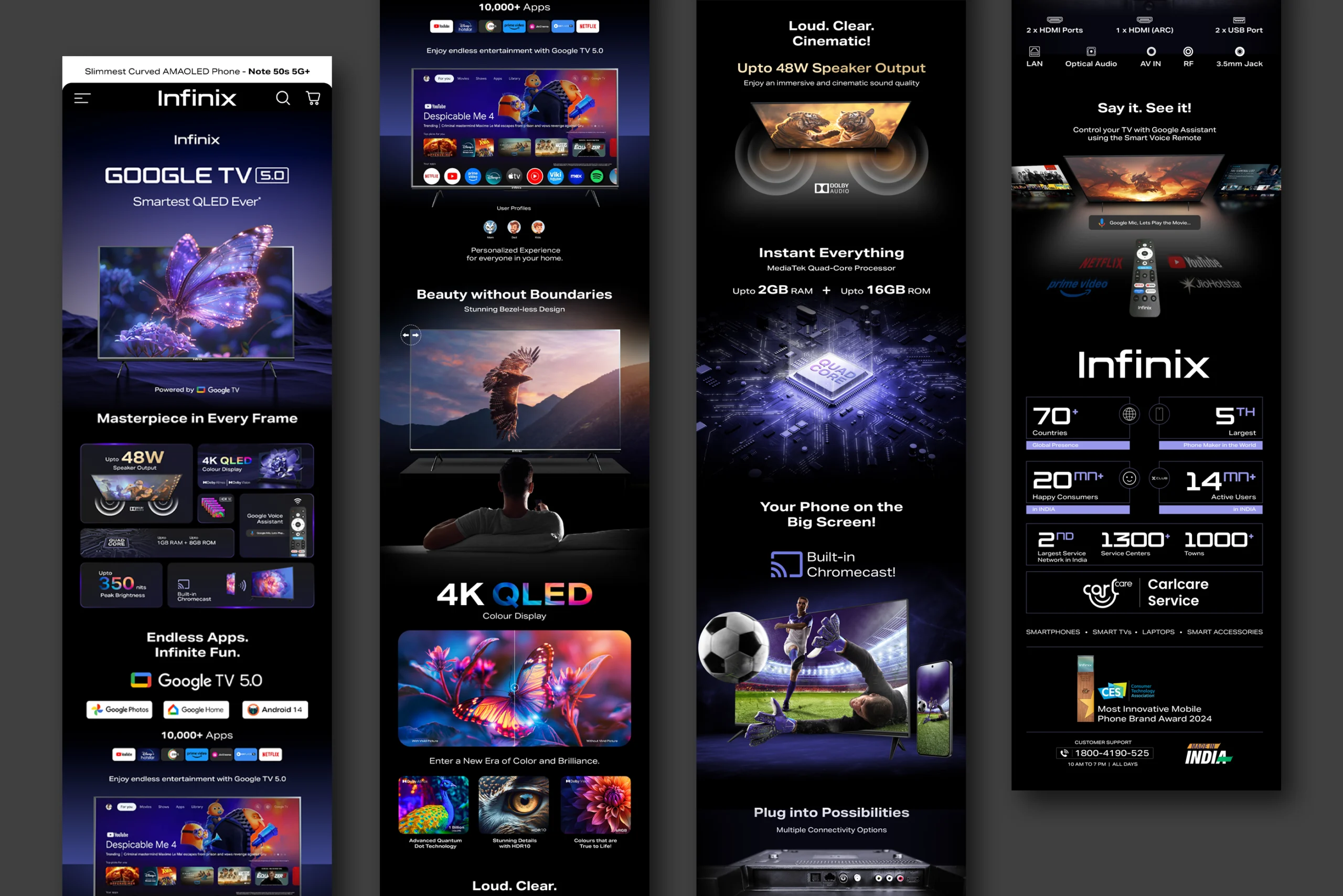
The Google TV Page Design is a landing/web page UI/UX project created to showcase Google TV in a visually compelling, clean, and intuitive fashion. The design aims to present product features, smart-TV visuals, and content options with clarity and style, enhancing user engagement while maintaining brand consistency.
Design Features & Approach
This page design emphasizes clean layout, high-quality imagery, and clear typography to reflect the premium nature of Google TV. The approach includes using large hero banners with smart-TV visuals, feature sections broken into digestible clusters, and interactive elements that guide the user’s eye without overwhelming.
Visual hierarchy and whitespace are used liberally to ensure important information like specifications, feature callouts, and content categories get attention. Dark/light accents, consistent iconography, and bold typography help in readability and branding, especially for users scanning quickly. The UI/UX was designed to feel modern, sleek, and intuitive, delivering a page where form and function work together.
Details
Time Frame:
Aug 25 – Sep 25
Role:
Visual Designer, UI/UX Designer
Software:
Photoshop, Afer Effects, Figma
Challenges
One challenge was balancing visual richness (images, TV visuals, content thumbnails) with page load times and simplicity so that users don’t feel overwhelmed. Ensuring content hierarchy so features, specs, and imagery are easy to consume without clutter was key. Another challenge was making sure that the design remained responsive, looking great on large screens as well as tablets or smaller devices, given that smart TV product pages often get viewed across multiple platforms.
Learning
Through this project, I learned how crucial it is to prototype with real content, test visual balance, and prioritize performance alongside aesthetics. Also, aligning brand guidelines (color scheme, typography, icon style) with a modern UI design while still giving space for creativity required careful iteration.
Case-Story (Problem → Solution → Result)
Problem
Google TV’s product pages can sometimes be generic, verbose, or visually busy, which makes it hard for prospective users to quickly understand what’s unique about the product and its content offerings. Many visitors leave without a clear sense of features or value.
Solution
The page design was reimagined to lead with strong visuals, clean feature summaries, and well-structured content. The layout uses distinct sections for everything—hero visuals to grab attention, feature blocks to explain benefits, content previews to show real-use possibilities, and technical specs presented cleanly. Interactive visual cues and clear typography help guide the user. The design showcases Google TV’s offering (such as content, smart interface) in a coherent, visually pleasing manner.
Result
The redesigned page gives users immediate visual impact, clear understanding of what Google TV offers, and easy navigation toward purchasing or exploring content. It enhances user engagement by reducing confusion and improving clarity. The brand feels more premium, the product benefits are more obvious, and overall impression is elevated. Potential conversions are supported by clearer UX, stronger visuals, and more compelling storytelling.