The Smartwatch UI Kit is a thoughtfully designed set of smartwatch interface components. It features a full suite of UI elements and screen templates intended for modern smartwatch apps, combining clean aesthetics with functional design. The kit aims to streamline UI/UX workflows by offering ready-to-use layouts that adapt well to small screens, emphasizing clarity, usability, and visual consistency.
Project Details
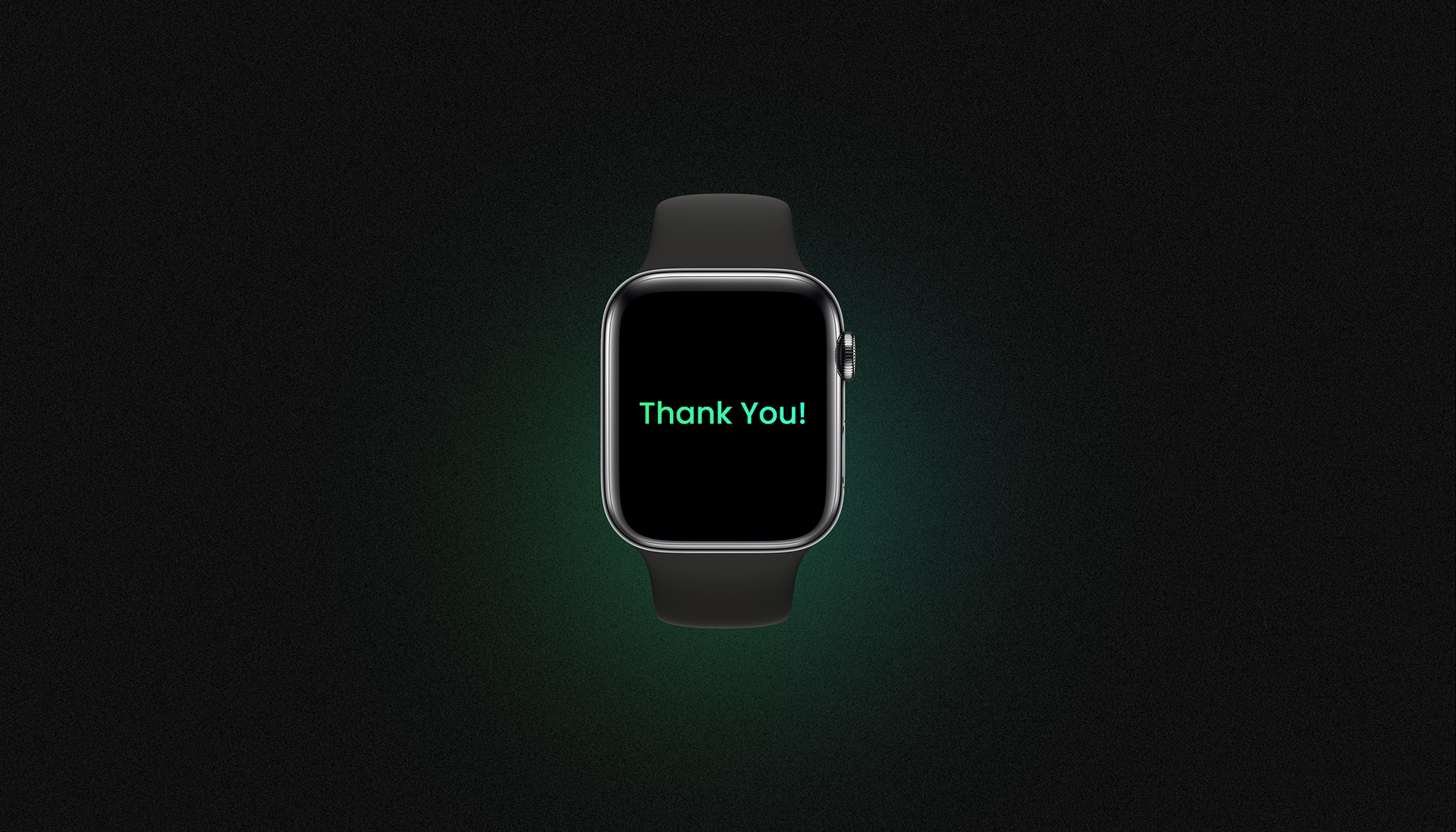
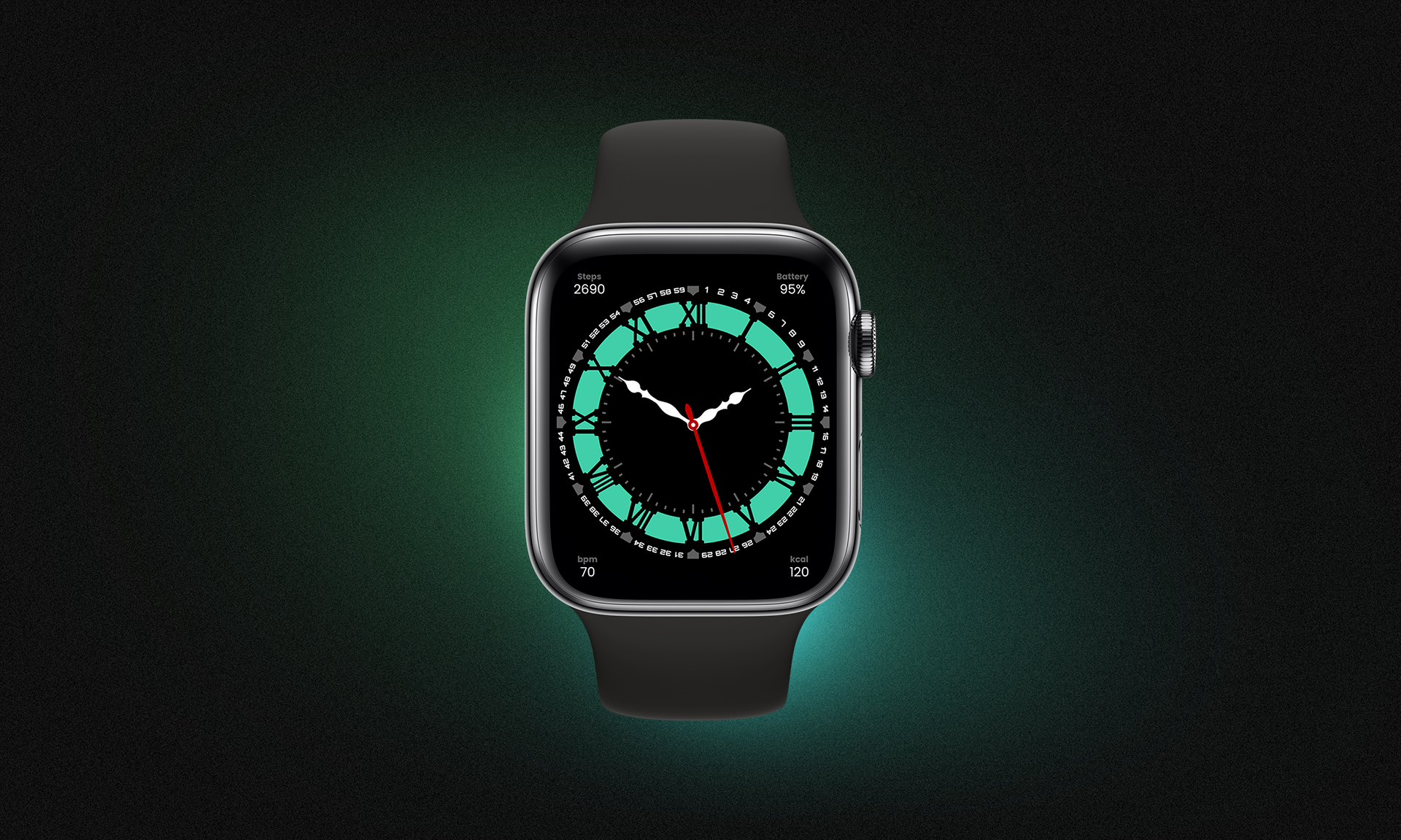
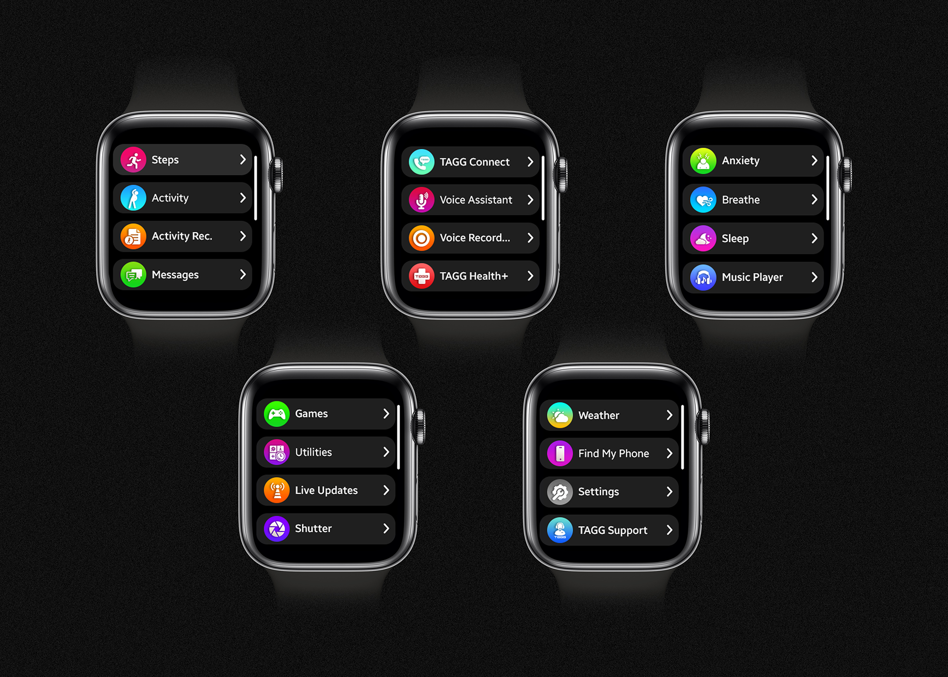
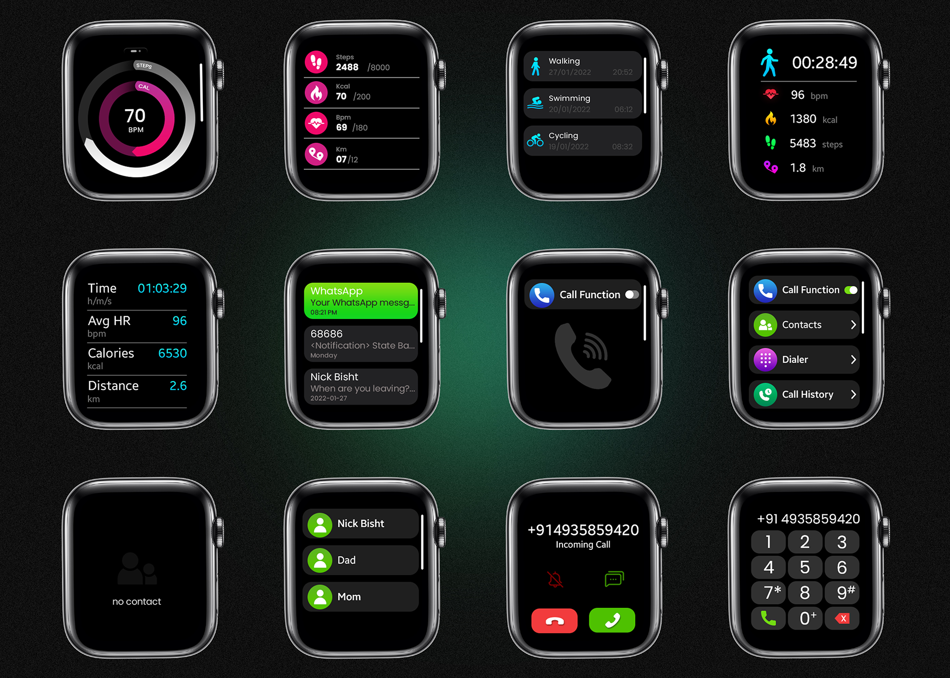
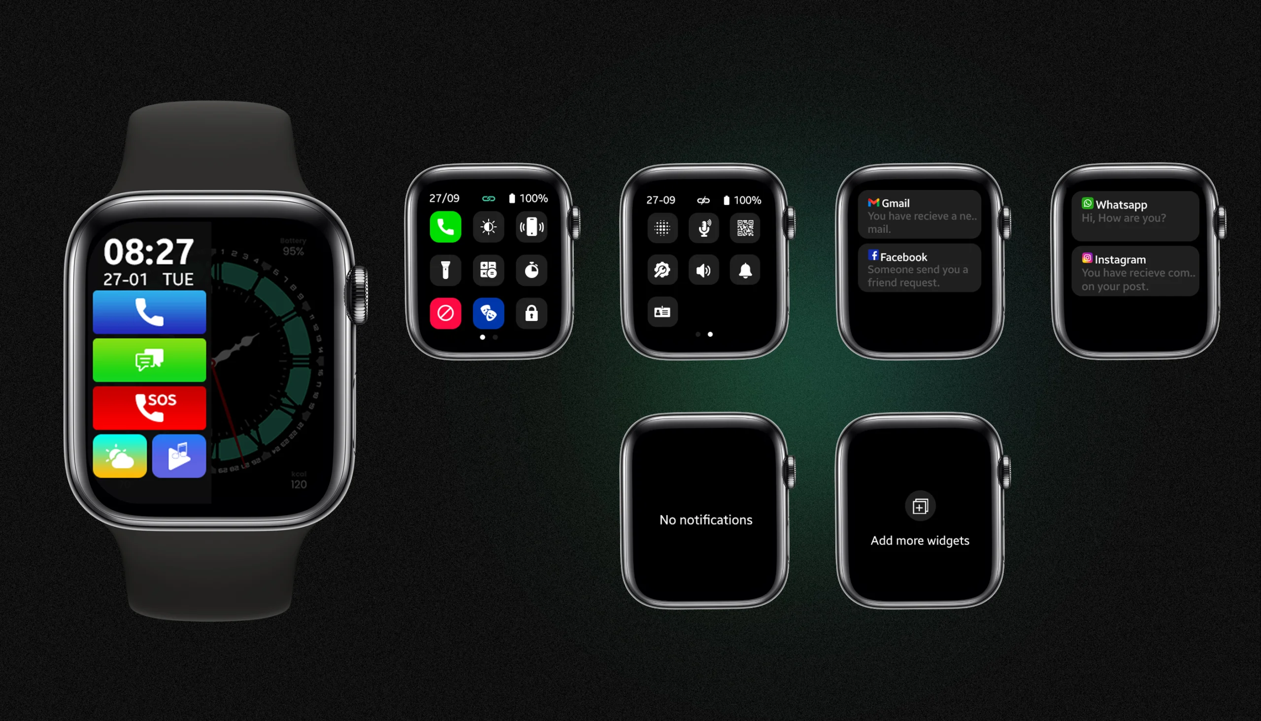
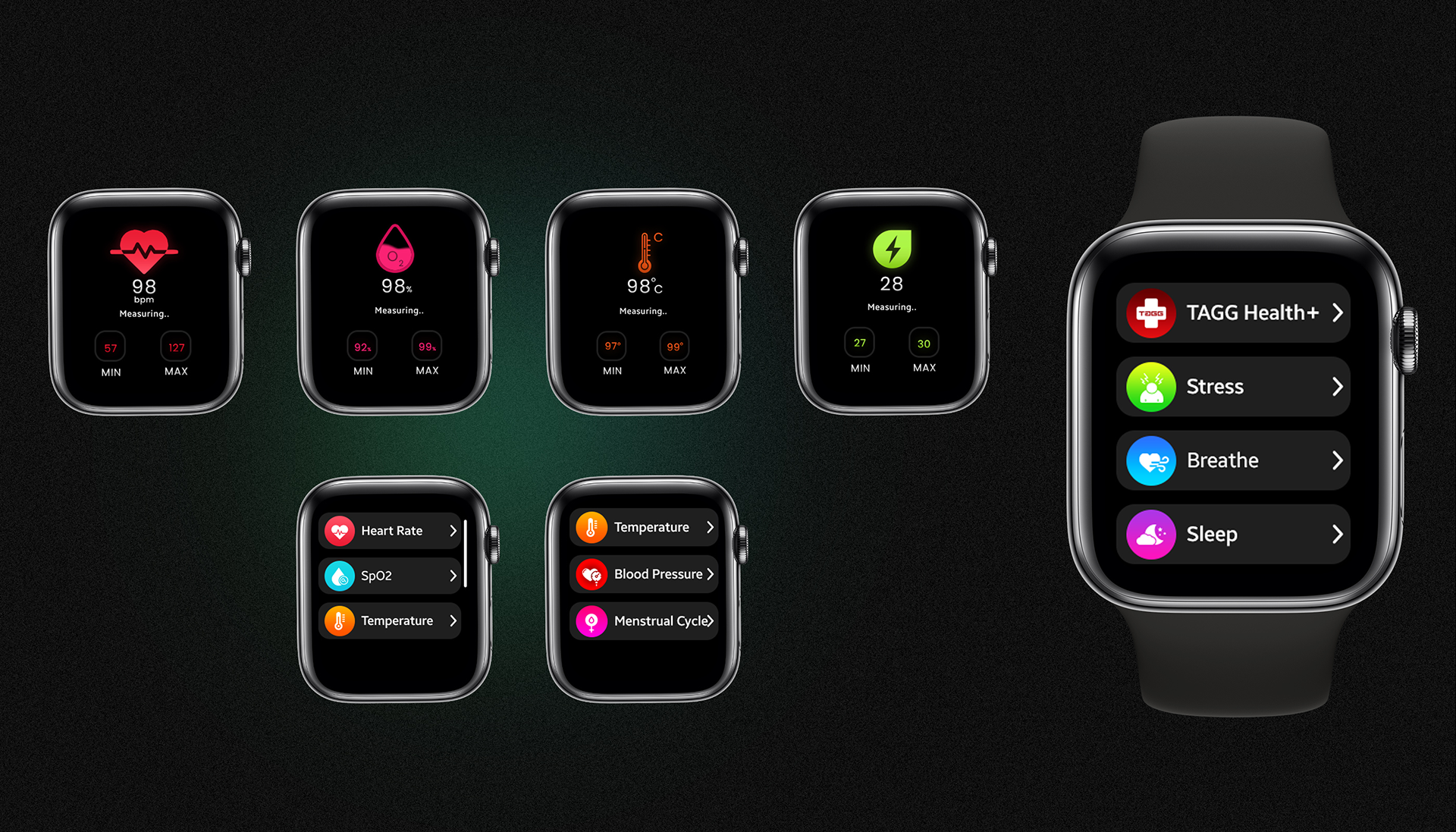
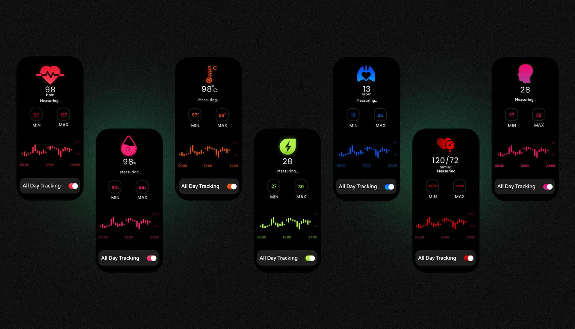
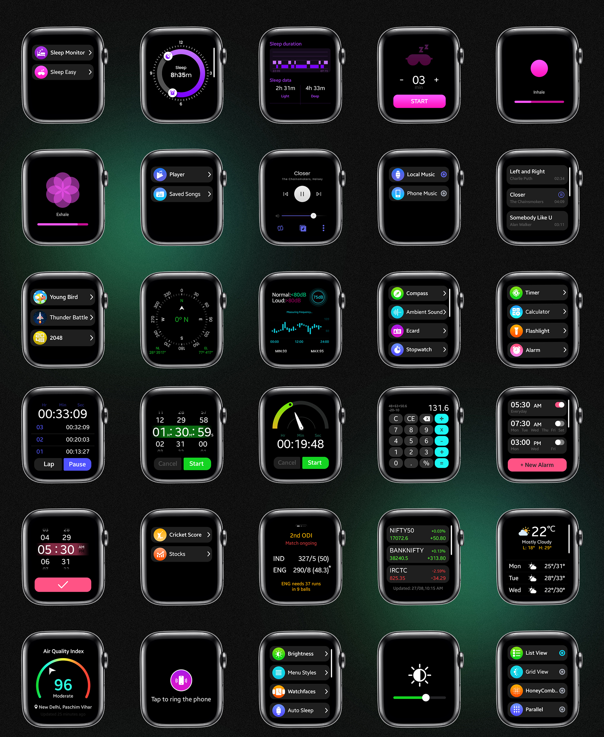
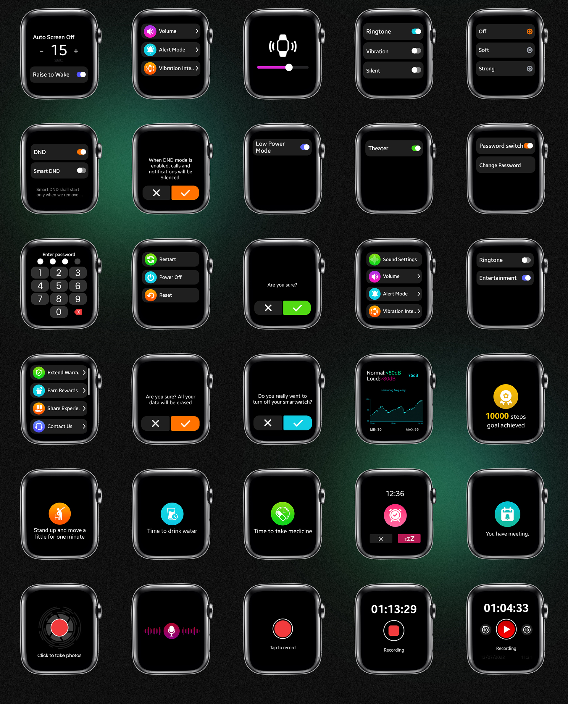
This project featuring a curated set of interface elements and screen designs specifically for smartwatch form-factors. The assets include templates for activity or health tracking screens, notification screens, progress rings, buttons, toggles, and typography styles optimized for small, round or rectangular watch faces.
Visual mockups demonstrate how these components look in real usage, showing both aesthetic polish and functional clarity. The design approach uses scalable vector graphics, light and dark mode adaptability, and emphasis on readability under different lighting and motion conditions. The result is a versatile UI toolkit that can be adapted across multiple smartwatch apps with differing requirements.
Details
Time Frame:
Dec 22 – Jan 23
Role:
Involvement:
Figma, Photoshop, Illustrator
Design Features & Approach
In building this UI Kit, the focus was on creating a broad yet coherent system of interface elements—buttons, charts, toggles, progress rings, typography styles, and screen templates—that could be composed into multiple use cases. Clean lines, consistent spacing, and scalable vector components ensure the kit works well in different lighting conditions and hand positions. Typography and iconography are designed for legibility at glance, with minimalist design cues. Color usage is restrained yet modern, enabling both light and dark modes. Each component is rendered in mockups to show how it behaves on actual smartwatch displays, thus bridging design with realistic usage.
Challenges & Learning
Working on interfaces for small wearable displays posed challenges around balancing information richness with visual simplicity—too much data clutters the screen, too little undermines usefulness. Ensuring that UI elements such as labels, charts or progress indicators are readable at a glance was crucial. Also, consistency across many component types—buttons, toggles, widgets—was critical so users feel familiar across screens. Another learning was designing for various interactions (swipe, tap, long-press) and ensuring feedback is visible without overwhelming. Finally, mockups and previews helped reveal issues in scaling or color contrast that weren’t obvious in flat design files.
Problem
Smartwatch apps often suffer from cramped interfaces, inconsistent component styles, or unclear visual hierarchy, which leads to frustration when users try to glance at their watch for feedback. There was a need for a UI Kit that balances aesthetic minimalism with functional clarity, optimized for tiny screens.
Solution
The Smartwatch UI Kit was developed as a comprehensive library of components and screen templates. By emphasizing clean typography, consistent spacing, scalable vector assets, and strict guidelines for contrast and readability, the kit ensures that each UI element is crisp, usable, and coherent. Realistic mockups were created to test these designs under real-use conditions (dim light, quick glances, motion, etc.).
Result
The resulting UI Kit provides designers and developers with a toolset that speeds up smartwatch app design while improving usability. Interfaces built using the kit appear polished and consistent, improving user experience by making information easy to absorb at a glance. The kit’s visual coherence helps maintain brand strength across multiple screens in wearable experiences.