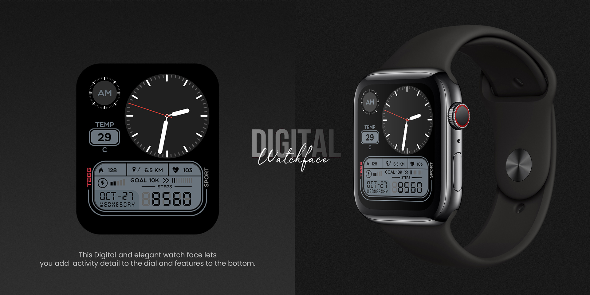
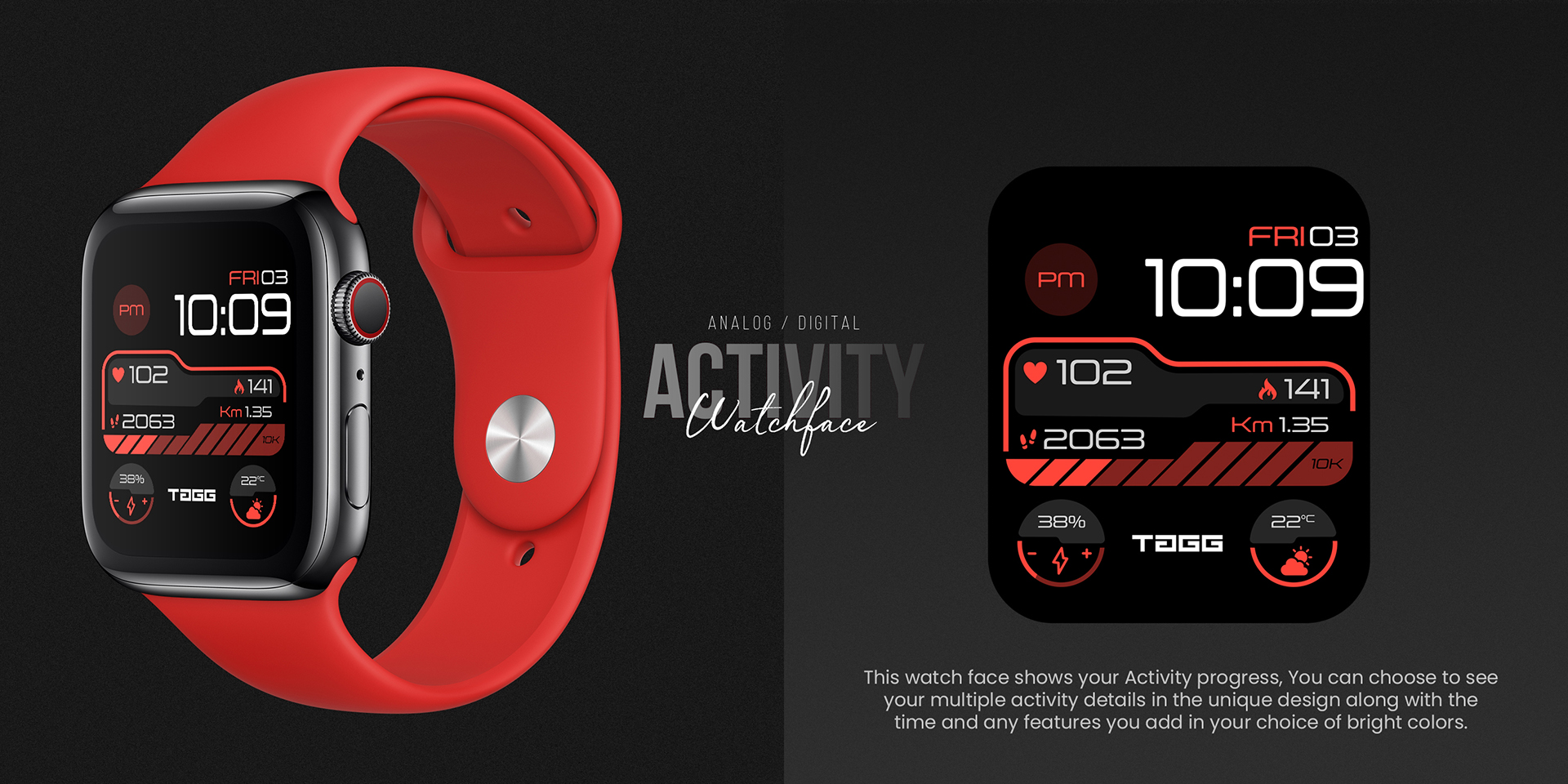
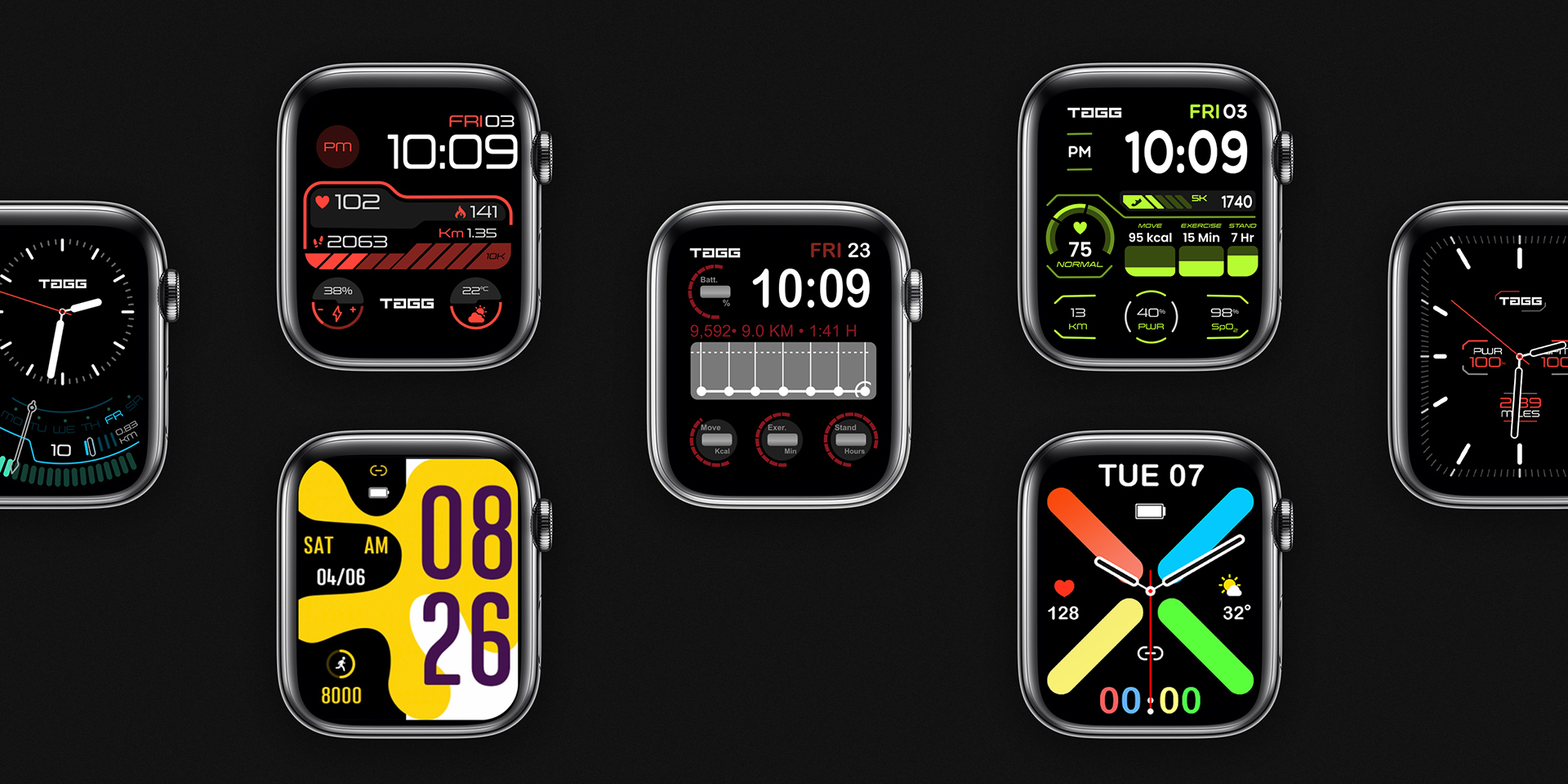
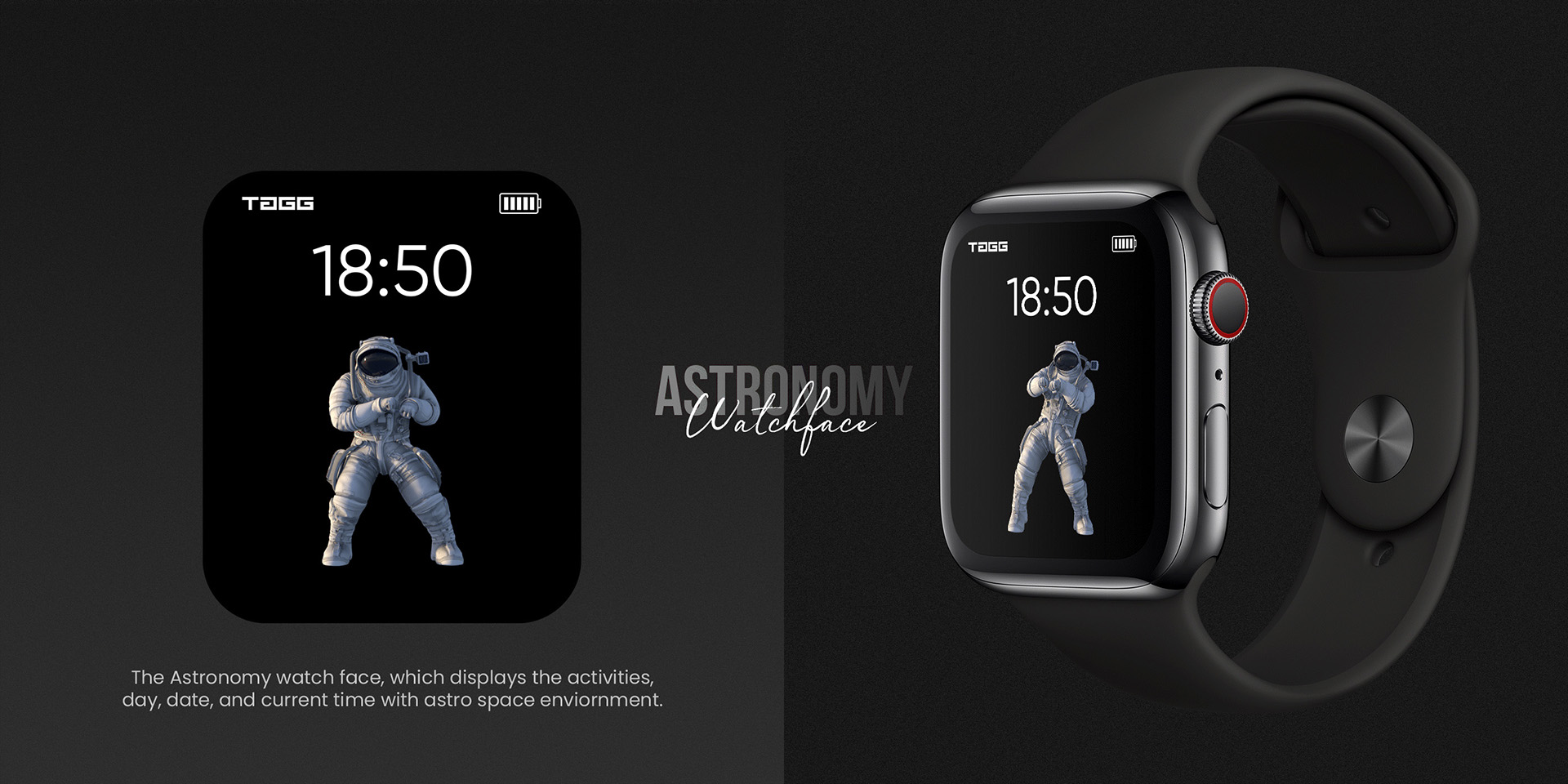
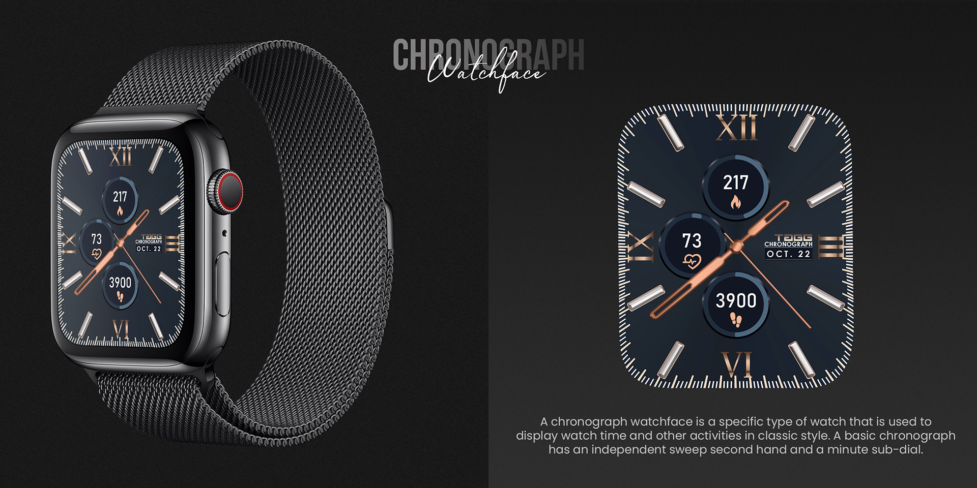
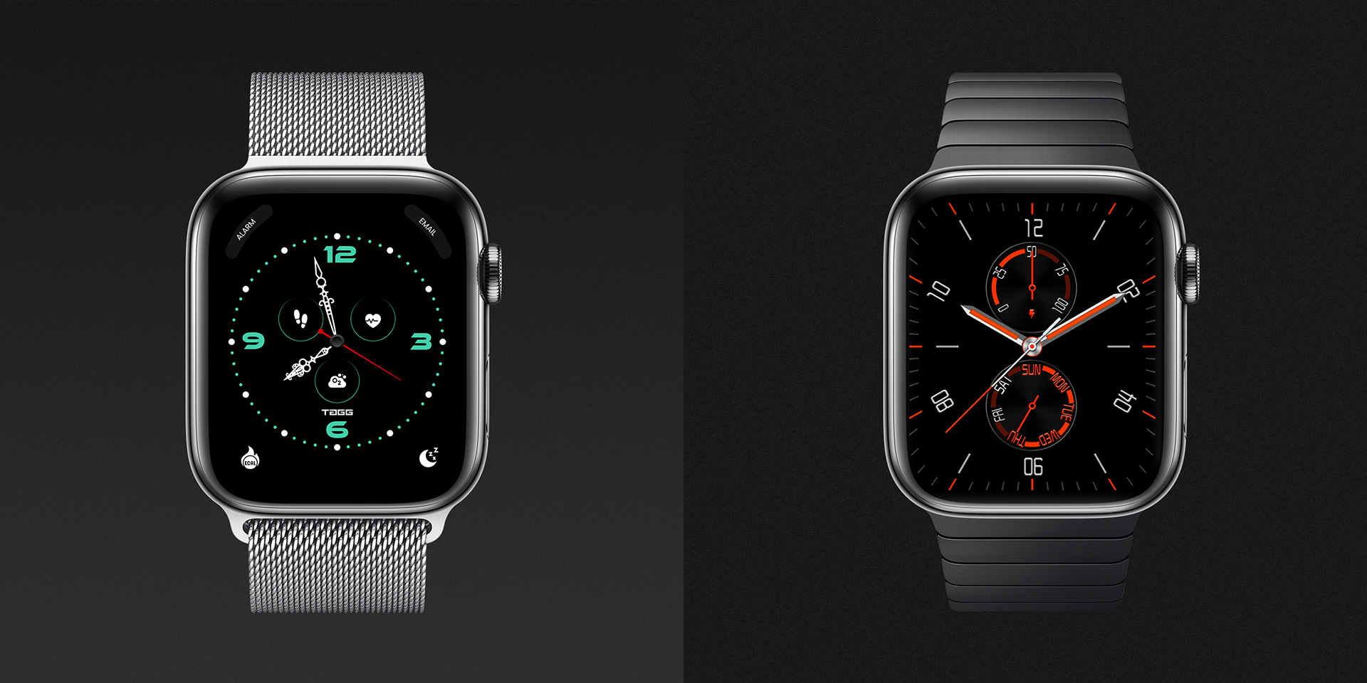
“Watchface Design” is a smartwatch interface project that reimagines time display by merging classic analog clock aesthetics with modern activity tracking. The design lets users monitor their movement progress via Activity rings that overlap or appear as sub-dials, all laid over a traditional clock face. Large, consistent typefaces enhance legibility, and every element is crafted to deliver both function and style in one sleek watchface design.
Project Details
In this interface design, I focused on creating a visually clean watchface that balances elegance and usability. The core interaction includes showing Activity progress in two versatile styles—stacked Activity rings or integrated sub-dials—so users can choose what suits them best. Typography plays a major role: the fonts are oversized and uniform to ensure quick readability at a glance.
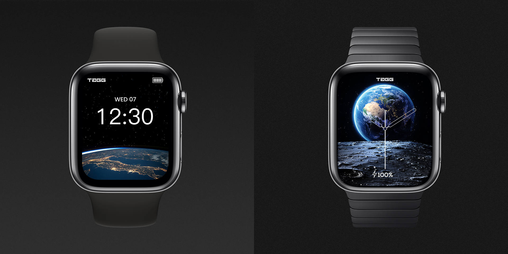
The design weaves together familiar analog clock visuals with digital health tracking to provide a seamless experience. Attention was given to how the interface looks at different scales and on different parts of the watch screen, ensuring all elements are clear and beautifully aligned. Realistic mockups and 3D renders show how the watchface appears in real life, under varied lighting and usage scenarios.
Details
Time Frame:
Role:
Software:
Photoshop, Illustrator, Figma

Design Features & Approach
The watchface blends classic analog aesthetics with modern activity tracking. Users can choose between overlapping Activity rings or sub-dial layouts for flexibility, while bold, oversized typography ensures quick readability. A clean layout, balanced spacing, and realistic renders highlight how the design adapts seamlessly to both everyday wear and active use.
Challenges & Learning
The main challenge was balancing style with usability on a small screen. Too much data risked clutter, while too little reduced functionality. Integrating activity tracking into an analog interface without disrupting its elegance required experimentation. This taught me the importance of designing for both clarity and context.


Problem
Most smartwatch interfaces struggle to balance style and functionality. Users often find them either too cluttered with data, making them hard to read at a glance, or too minimal, leaving out essential health and activity information. The challenge was to design a watchface that not only looked elegant but also delivered a seamless user experience with clear readability and intuitive integration of fitness tracking.
Solution
I designed a smartwatch interface that merges the timeless appeal of an analog clock with the practicality of modern health tracking. The watchface offers users two options for viewing their activity data—either through overlapping Activity rings or sub-dial displays—ensuring flexibility and personalization. To enhance legibility, I used bold and consistent typography with oversized fonts that are easy to read in any condition. The UI was carefully structured to remain uncluttered while still presenting essential data like time, activity progress, and metrics in a visually balanced way. Realistic mockups and renders were created to demonstrate how the design adapts under different lighting scenarios and in real-world usage.
Result
The final design delivered a clean, versatile, and user-friendly watchface that enhances the smartwatch experience. By fusing analog elegance with modern activity insights, the interface achieved both aesthetic appeal and functional value. The design successfully showcased how thoughtful UI/UX can transform a smartwatch into not just a timekeeping device, but a personal style statement and fitness companion.
